Crafting a harmonious drink for the health conscious.
A grab-n-go beverage option for consumers with dietary restrictions doesn’t come easily, especially lactose-free options. With more and more interest in milk alternatives and health consciousness growing and slowly becoming the norm, we wanted to bridge the gap by providing the health-conscious with the drink that loves them so matcha!
The average consumer with specific dietary restrictions has a hard time finding an on-the-go drink that satisfies their taste buds and stays within their lifestyle. The healthy drink market is rapidly growing, but there is still a standard that still needs to be set. That’s where Matcha Moments comes in…
What I Did
Visual Identity
Brand Guidelines
Product Design
Timeline
Q2 2023 – Q3 2023
Visual Identity
Usage of whitespace with high contrast can often come across as brash, but with the brand’s visual identity, we wanted to explore a sort of yin-yang approach to high contrast. Contrasts may still be present, but they exist with care to keep harmony intact.
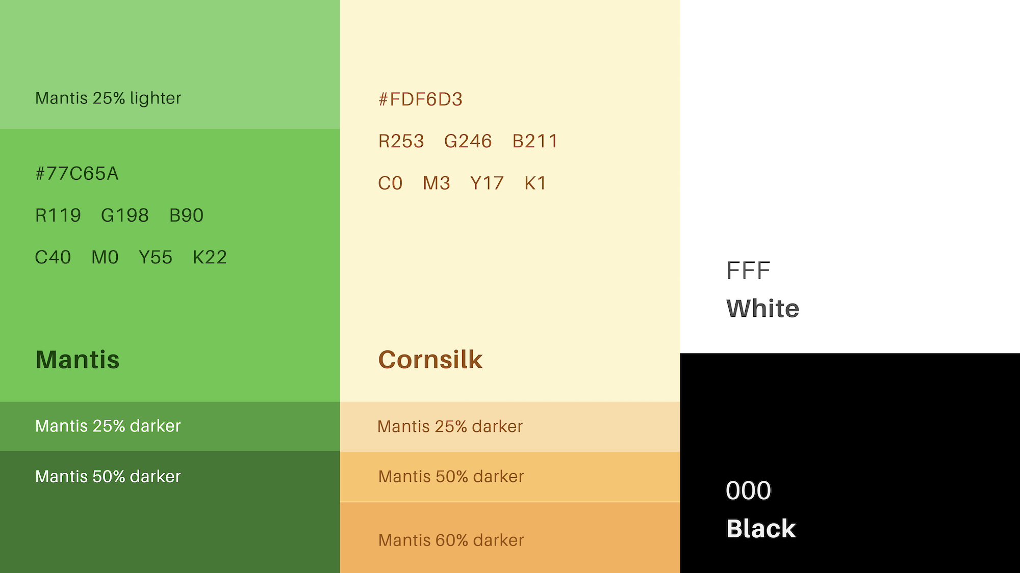
The color palette brings earthy and warmness to the cooler black and white, balancing out that stark sterile feeling that comes with the usage of pure black and pure white. There’s also a trend of Matcha brands being quite muted, often using mellow greens. But when looking at how matcha quality is accessed, high-quality matcha is more pigmented. So, I switched out the muddy greens for a more vibrant scheme to reflect the integrity of the Matcha Moments product.


Matcha, packaged with love!
A beverage line is constantly evolving, new exciting flavor profiles are continuously developing to provide consumers with just the right... Matcha Moment.
I was able to curate a design system for the Matcha Moments line of matcha beverages that would encapsulate the many unique flavor combinations. Tapping into the harmonious and calm nature of the brand, the labels are a reflection of that feeling of zen without forfeiting a distinct identity.
Color combinations change as the flavor profiles change, reflecting the ingredients back to the consumer as Black sesame can be easily identifiable with its black Matcha Moment banner and so forth.
Connecting with your Matcha Moment.
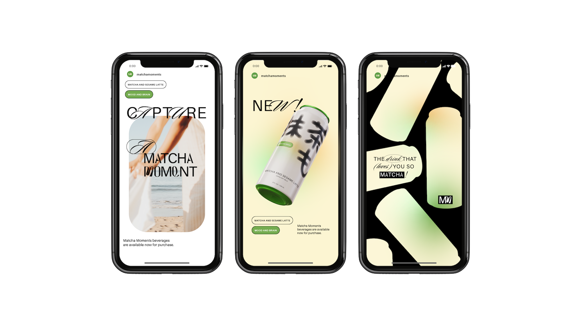
This takes the form of the campaign, “A Matcha Moment”. Encouraging people to capture their 5 am ‘hot girl walks’ to their fun beach day with friends, we want to see the moments the Matcha Moments brand is now a part of.
Matcha Moments firmly situates itself into the Lover archetype, valuing strong connections to the community they serve and instilling confidence in your body. That message is reflected in the way Matcha Moments interacts with its audience.
Adorning the motto, “the drink that loves you so matcha,” Matcha Moments as a brand shows it cares by providing something good for the inside that reflects outward. With the health benefits of Matcha and the corresponding flavors, the Matcha Moments team is interested in what their audience does with their newfound energy and confidence.
I’ve identified three brand attributes that set Matcha Moments apart. the aim is to create a sense of balance, harmony, and well-being in the lives of our customers.
Calm to express the brand’s pose and balance.
Casual represents Matcha Moments’ desire to make a no-nonsense trust in our audiences and continuous open dialogue.
Unfiltered demonstrates the aim to capture the beauty in the little moments.


